
Interior design trends: The colours of 2026
The colours we choose for our homes do more than simply decorate a space - they shape how we feel in our homes from day to day. Whether you want to create a cosy warmth or an energising vitality, it’s all possible. As we move into 2026, interior design is embracing a more thoughtful, personal approach to colour.
In this guide, we explore the interior design colour trends of 2026 and how to incorporate them into your home with elegance and longevity in mind. Whether you’re planning a full renovation or a subtle refresh, the right palette can transform your space into something truly exceptional.
2026 interior design colour trends
In the late 2010s and early 2020s, colour became a rarity in interior design, with many homeowners opting for clean, classic neutrals instead of loud, flashy or saturated hues. Lately, though, trends are veering back into a middle ground: soft, grounded shades that are both quiet and expressive
This year, we’re seeing a marked shift towards nature-inspired tones, from muted greens and blues to gentle floral shades. With digital fatigue becoming rampant, many are transforming their homes into reminders of the real and tangible - and that means out with the harsh whites and moody greys, and in with something a little more cheerful.
An emphasis on cosiness has seen living rooms and bedrooms turn from sterile, neutral enclosures into warmer, more expressive places to relax and sleep. And in kitchens and bathrooms, calm, tranquil hues are becoming more popular than ever before.
Below are our five favourite examples of this colour trend.
Pretty peaches
Peach is set to be one of 2026’s most versatile and uplifting interior design hues, offering a gentle warmth that sits beautifully between soft neutrals and more expressive tones. Its understated elegance makes it particularly well suited to both kitchens and bathrooms, where it can introduce colour without overwhelming the space.
In kitchen design, peach works wonderfully on cabinetry or feature islands, especially when paired with natural materials such as light wood or marble worktops.
For bathrooms, peach-toned tiles or painted walls can create a spa-like atmosphere, adding warmth while maintaining a light, airy feel.
For a more layered look, peach pairs effortlessly with muted greens, warm taupes and off-whites. Whether used as a focal point or a supporting shade, peach allows you to create a space that feels both contemporary and inviting.
Medium greens
Medium green is emerging as a defining colour for 2026, bringing a perfect balance between boldness and tranquillity to living spaces. Rooted in nature, this versatile shade adds a sense of calm and connection to the outdoors, making it an ideal choice for the home.
In home office design, medium green walls, curtains or cabinetry help to create an aura of focus and productivity without resulting in a gloomy atmosphere. Paired with warm metallic accents such as aged brass or copper, medium green can make a confident yet timeless statement.
To elevate the overall scheme, medium green goes well with earthy neutrals, muted pinks and crisp whites. Whether used across full surfaces or as an accent, it introduces richness and character while maintaining a refined, liveable aesthetic suited to modern homes.
Soft yellows
Soft yellows are bringing a renewed sense of optimism to interiors in 2026, offering a delicate way to introduce warmth and light into the home. Subtle rather than overpowering, these gentle tones work beautifully in both kitchens and bathrooms, creating spaces that feel uplifting yet calm and balanced.
In kitchens, soft yellow cabinetry or wall colours can brighten the room without dominating it, especially when paired with natural wood finishes, white worktops or brushed metal accents. The result is a welcoming, sunlit feel that enhances everyday living.
In bathrooms, soft yellows help to create a restful environment with a hint of warmth, working particularly well with layered textiles, soft greys and muted neutrals.
Whether introduced through accents or splashed across whole walls, soft yellow offers a timeless way to add light and positivity to your home all year round.
Dusky pinks
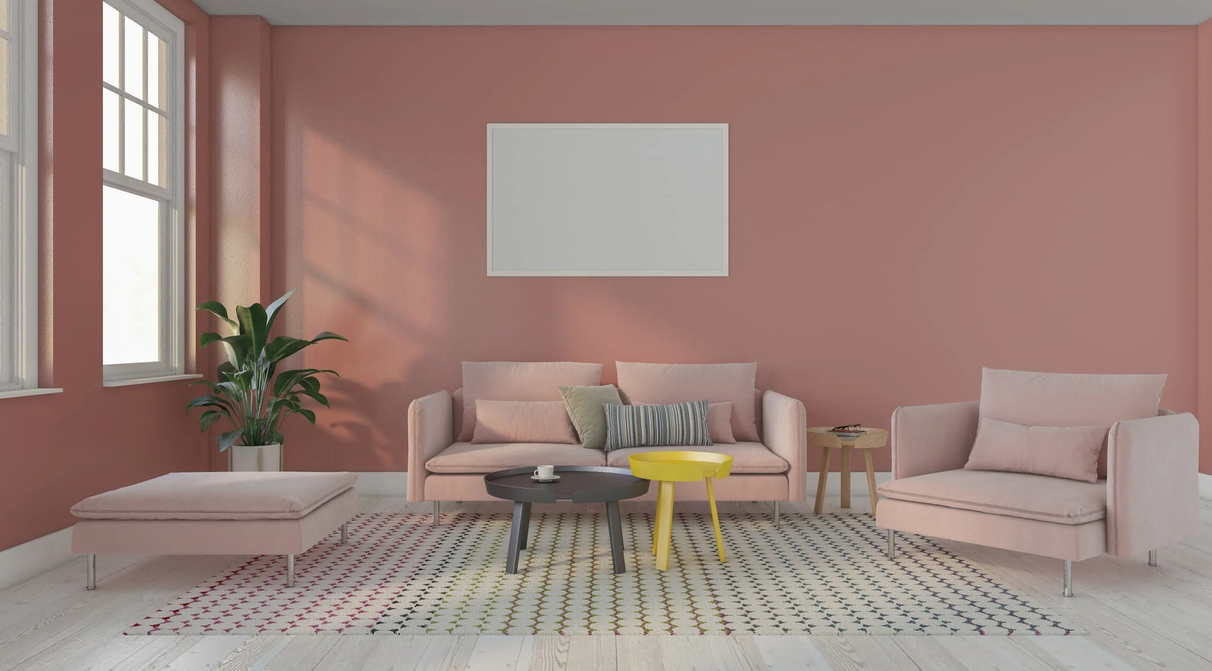
Dusky pinks are set to remain a firm home décor favourite in 2026, offering a sophisticated alternative to more traditional neutrals. With their muted, slightly earthy undertones, these shades bring warmth and softness without feeling overly feminine, making them a versatile choice for both bathrooms and bedrooms.
In bathrooms, dusky pink tiles or painted walls can create a calming atmosphere. When paired with brushed brass fittings, natural stone or soft lighting, the result is a space that feels both luxurious and inviting.
In bedrooms, dusky pink works beautifully across upholstered headboards, feature walls or layered textiles, helping to create a restful and cocooning environment. Reminiscent of spring and summer flowers, this shade speaks of growth, energy and refreshing changes.
To keep the look contemporary, dusky pink works best with warm greys, deep greens and off-whites. Add splashes of pink through throw cushions and other accents, or consider going all in with dusky pink wallpaper or paint.
Deep blues
Muted deep blues are set to define sophisticated interiors in 2026, offering depth, calm and a sense of quiet confidence. These rich, softened tones work beautifully in both home offices and bathrooms, where atmosphere and functionality are equally important.
In home offices, muted deep blue cabinetry or wall colours can create a focused, grounding environment that supports productivity without feeling stark. Paired with warm woods, leather accents or brushed metals, the overall look feels refined and considered - and the richness of the colour can really help to make a small room feel bigger.
In bathrooms, these tones lend themselves to a more indulgent setting. Used across tiles, vanity units or feature walls, muted deep blues add a sense of luxury while maintaining a soothing ambience.
For a balanced scheme, pair deep blues with crisp whites, soft greys and natural textures such as stone or timber. Metallic accents such as brass or chrome can add a luxurious touch as well.
As we look ahead to 2026 and beyond, colour is no longer just a finishing touch - it’s a fundamental part of how a space feels and functions. By choosing tones that reflect your lifestyle and layering them with care, you can create interiors that feel both timeless and deeply personal.